
We've moved. You'll still be able to read all the old posts, but the blog has joined up with the ADR Design website to make one super awesome site.
If the redirect doesn't work in the next 5 seconds, please click the link below.
www.adrdesignonline.com
Monday, February 7, 2011
Thursday, February 3, 2011
ADR Design is starting anew.
Hey -
It has been a while since I posted anything, and that is because I have been hard at work. ADR Design is undergoing a complete branding overhaul. There is a new logo. There is a new blog. There is a new website. There is a new twitter account and theme. There is a new Facebook business page. There is new EVERYTHING and I can't WAIT. The new look and feel of the website is something that is very me, and it is something I'm incredibly excited about.
Everything will be unveiled this coming Monday, February 7th, beginning with the launch of the new adrdesignonline.com. This will be your new hub for all things ADR Design and all things me. From there, you can easily get to my portfolio, my social media pages, and my blog (which will be located at adrdesignonline.com/blog/) and even my acoustic band a&b. Please check adrdesignonline.com on Monday. See you then!
Sunday, January 9, 2011
Liquid Planet is a weird name for a lunch place
So I was dining at a relatively new Cleveland yuppy chain called "Liquid Planet", which was quite yummy, when I looked to my right and saw this:
This didn't seem to phase my girlfriend, but I couldn't stop laughing. This smoothie and wrap lunch establishment seemed to want me to think that eating there can make old people frighteningly bouncy and make your kids do well at gymnastics. The facial expressions in this photo may be a little hard to see, but I definitely think the blue-hairs on the right seem waaay too happy as they skip down the orange street. And the 20-something guy in the middle looks completed nonplussed as he is vaulted over by his sister(?) like some sort of human pommel horse. And all of it was photoshopped over some orange and yellow sunburst which feels like it should be out of a cautionary global warming ad.
All in all we had a good meal, but I was a little freaked out to say the least by the odd mural-sized advertisement right by our booth.
Liquid Planet Rating:
Atmosphere: B- (only because of the scary old people in the pic)
Food: Yummytown.
On a different note, I am currently trying to export my blogposts from here to move my blog to a new location. Stay tuned!
 |
| Scary Liquid Planet Wall Decoration |
This didn't seem to phase my girlfriend, but I couldn't stop laughing. This smoothie and wrap lunch establishment seemed to want me to think that eating there can make old people frighteningly bouncy and make your kids do well at gymnastics. The facial expressions in this photo may be a little hard to see, but I definitely think the blue-hairs on the right seem waaay too happy as they skip down the orange street. And the 20-something guy in the middle looks completed nonplussed as he is vaulted over by his sister(?) like some sort of human pommel horse. And all of it was photoshopped over some orange and yellow sunburst which feels like it should be out of a cautionary global warming ad.
All in all we had a good meal, but I was a little freaked out to say the least by the odd mural-sized advertisement right by our booth.
Liquid Planet Rating:
Atmosphere: B- (only because of the scary old people in the pic)
Food: Yummytown.
On a different note, I am currently trying to export my blogposts from here to move my blog to a new location. Stay tuned!
Saturday, January 1, 2011
Happy New Year from ADR design!
Hey everyone! With the craziness of the holidays upon me I have found it increasingly difficult to post new things on my blog, but I would like to wish everyone a happy new year. Happy 2K11!
 My plans so far for this year are big. First, I am working on re-branding myself and ADR design, which will include a new logo design (which I am currently working on), a new blog, a new website, and lots more tie-ins across my various social media platforms, including twitter (my handle is "i_made_dat" if you want to follow me), Facebook, myspace (updating my old personal musician website), and LinkedIn. Once all that is complete, I am going gung-ho looking for graphic and web design jobs in Cleveland, and I couldn't be more excited about it.
What are your plans for 2011?
What are your plans for 2011?
Friday, December 10, 2010
Comedy Central Re-Branding
This is a pretty cool video that shows Comedy Central's new logo and look for 2011. They have had this logo for a long time:

but they have completely revamped their branding and are going for a much more modern look. It is very simple and I think it's a pretty cool move on their part. Watch the video below.
| Comedy Central Press | ||||
| Comedy Central: Refreshed and Rededicated | ||||
| ||||
Wednesday, December 1, 2010
The Cleveland Sound
Been a while since I posted, huh! Well, I've been busy with the holidays, as I'm sure you have too. Snow is coming down hard outside - a good(?) way to kick off December!
I just was hired to help out with a website that someone is working on called The Cleveland Sound. They had a designer but he backed out or couldn't do what needed to be done, so I was brought in to help. I made some edits to a Wordpress theme, moved some things around, added some stuff behind the scenes to make it run a little faster and created a very quick logo to replace the default type. The site has no content right now - just lorem ipsum and some random photos from Google, but it's where the owner wants it, and I'll let you know when it is up and running at full steam.

Until then, you can check it out at http://www.theclevelandsound.com/ or click on the screenshot above.
I just was hired to help out with a website that someone is working on called The Cleveland Sound. They had a designer but he backed out or couldn't do what needed to be done, so I was brought in to help. I made some edits to a Wordpress theme, moved some things around, added some stuff behind the scenes to make it run a little faster and created a very quick logo to replace the default type. The site has no content right now - just lorem ipsum and some random photos from Google, but it's where the owner wants it, and I'll let you know when it is up and running at full steam.
Until then, you can check it out at http://www.theclevelandsound.com/ or click on the screenshot above.
Wednesday, November 17, 2010
Creative Hands Ad Campaign
I've been pretty busy recently, and I just started working for Ohio Web Technologies this week so I don't have much of my own stuff to post right now, but I received the following ad campaign in an email the other day. While I had seen one or two of the ads in the campaign before, seeing them all one after the other really blew me away. From what I can tell, they seem like they were most certainly done in photoshop, using lots photos of hands.
Click the photo below to see all the ads.

Click the photo below to see all the ads.
Wednesday, November 10, 2010
Walk the Moon, please
Over the past few weeks I worked on the CD artwork for the band Walk the Moon. I posted the flyer for the album release a few weeks ago. W/M is having their CD release party in Cincinnati, Ohio this Saturday night, and I thought I would post up the art.
 |
| Left: Front cover Right: Back cover/track listing |
 |
| Inside: Artwork is a mix of 3 artists' work - I can't take all the credit! |
 |
| Disc |
Tuesday, November 2, 2010
Happy Halloween / Phun with Photoshop
Here are some festive Halloween pics that I Photoshopped for fun:


This was an image I used for my friend's Halloween party invitation. I took a photo from his facebook profile, used Live Trace in Illustrator to get a simple image of it, altered some colors, then blended it in with a real photo of a pumpkin using Photoshop. I could have spent more time making the light coming inside look real, but it was just a quick image for fun. (Side note: the way the live trace worked accidentally made his chin look like a ghost - awesome!)

This is me (in the center) and my friends dressed as the Incredibles for Halloween. I used Photoshop to edit out the background, add a new cartoony background and Incredibles logo, add feet (our legs were cut off at the knees in the photo), and tweak a few other minor details.

This photo and the two below are essentially unedited with the exception of the background being removed (and filling in body parts that were cut off in the original photos).


This is my friend Chris in costume as Frozone. I Photoshopped him on to Frozone's ski board from the movie. This picture is actually a composite of about 5 different images - the photo of Chris, The Incredibles logo, the ski board, the ice, and the red city background.
We entered a Halloween costume contest for the tights/spandex website we used. Please go here and click "Like" below to help us win!
Thursday, October 28, 2010
Evolution of a Logo: Creative Filmmakers - Part 3
After a little back and forth, my client ended up choosing the paint splotch/eyelash version of the first logo, and wanted the main logo display to have the text underneath. Here is the final logo:


I then added the logo in grey to her existing website at www.creativefilmmakers.org
More to come!
Friday, October 22, 2010
Evolution of a Logo: Creative Filmmakers - Part 2
Once my client received the logos I sent from Part 1, she said that she liked the first one (the eye) but that someone she showed it too said it looked remarkably similar to the CBS logo. Oops!


Too similar to use? Not sure. I doubt it is copyright infringement, but I tried altering it to make it a little more unique. I also wanted to do more with the creative part of the name Creative Filmmakers. The logo above shows an eye looking through a camera lens, or something along those lines, but it didn't seem quite funky enough for me. So, I tried these:

I simply added some eyelashes or something that resembled paint splotches (or the other way around).
I also tried one more design that was more playful, which I really liked, seen below:
More to come next week!
Monday, October 18, 2010
Evolution of a Logo: Creative Filmmakers - Part 1
A few months ago I wrote a series of posts showing my process from beginning to completion of Urban Chick Boutique's logo. You can view that series of posts here. I received a lot of comments on those posts, so I decided to do it again.
This time my client is a Cleveland-based independent film company, Creative Filmmakers. I have been hired to create a new logo for them, as well as do some work on their website, which can be viewed here.
I like to design logos first in black and white so that they look good if they ever have to be printed without color. Once the core logo is completed, I try adding color and see where it takes me/us. The client requested something fairly "corporate-looking," but with a bit of "arty"ness to it as well. Below are some of my first attempts at the logo:
For this initial design, I started with a large black circle, drew an eye shape and then subtracted it from the circle. Next, to make the pupil, I added a smaller black circle inside and subtracted an even smaller white circle from that to finish off the eye.

This was a second idea I had that plays with an abstract image of a film reel. It consists of mostly black and white circles as well, and I also used a paintbrush tool for the incomplete circles in the center and on the outside of the reel.

This was an example I gave to the client of how the logo would appear next to the name of the company horizontally. I added a white circle to the A to make a visual connection with the eye logo, as well as to emphasize the word creative.

This was an example I gave to my client of what the title would look like if we placed it underneath one of the circular logos.

Finally, just to provide another option for the client, I tried this logo which was simply the name of the company and a mock-up of a film strip, which is made solely of black and white rectangles.
Please check back later this week for more logo work for Creative Filmmakers. And please take a look at their work at www.creativefilmmakers.org!
Friday, October 8, 2010
Neighborhood Leadership for Environmental Health!
The past couple weeks I have been working on a website for a non-profit community organization in Cleveland called the Neighborhood Leadership for Environmental Health, or NLEH. You can view the website at http://www.nleh.org/.

Monday, October 4, 2010
i want! i want!
As you may or may not know, I was a longtime member of a band based in Cincinnati called Walk the Moon. I am no longer in the band, but they are going strong, and the band is getting ready to throw a big bash to release a long-time-coming album, called i want! i want!, as well as a really sweet music video for the first single, "Anna Sun". I am doing some of the promo materials for the show and for the band, the first of which is shown below.
 |
| Front of flyer |
 |
| Back of flyer |
For more information on the rockin show/video release/cd release, check the band's blog at walkthemoon1.blogspot.com. You can also listen to their music at www.myspace.com/walkthemoonband. If you are in the Cincinnati area, you should DEFINITELY plan to go to this party on November 13th.
Tuesday, September 28, 2010
Casa De Kraftmaid - Auction on October 30
This past week I was brought in to work with a few other designers on a site to advertise a large estate auction in Moreland Hills, Ohio (a suburb of Cleveland). The house is being sold by the founder of Kraftmaid Cabinetry, Richard Moodie, and the home is quite astounding. It is estimated to have cost around 8 million dollars and it includes a swimming pool, guest house, movie theater (with a lobby), gym, and so on!
Here is the site:
http://www.casadekraftmaid.com/

Here is the site:
http://www.casadekraftmaid.com/
Wednesday, September 22, 2010
Invitation shminvitation
Here is an invitation I made to a private art showing Gretchen Reifsnyder is having in the fall. Her paintings can be seen at watercolors1.blogspot.com.


This is the front, which uses a painting of hers that she selected. The information has been blocked out.

Here is the back, leaving plenty of room for addresses and stamps. I used Photoshop to isolate the frog from a more detailed painting and to extend the branch to about twice its original length.
Wednesday, September 15, 2010
Who knew the tilde could do so much?

So I just found out a trick using the tilde key in Adobe Illustrator. If you hold it down while you make a shape, it continuously makes the shape everywhere the mouse goes, so you get interesting wire-frame drawings. I decided to revert back to when I was 7 and would draw space stations and floating cities all the time. An example drawn only with the Rounded Rectangle Tool and the 'tilde' key is above.
If floating futuristic cloud cities aren't your thing, you can just make sweet shapes. Checkit:

Tuesday, September 14, 2010
It'll Tickle Your Innards!
I found out from a recent episode of Mad Men that Mountain Dew used to be advertised as hillbilly joy juice. It was promoted as “zero proof hillbilly moonshine” when it first came out in the 1940's. They even had a picture of a hillbilly trying to shoot another hillbilly (next to what looks like an outhouse) on the bottles until the 1970's:

Here is a very early commercial from 1966 featuring hillbillies, turkey-shootin' and a hot cartoon lady for your enjoyment:
I don't have that much to say on the topic, other than I find it interesting how the way you market something can have such an effect on how it is perceived by the public. These early ads are a far cry from the EXTREME marketing of the 90's and later, but apparently it still tastes the same. It also makes me wonder if that early marketing actually worked. Were there that many hillbillies/hillbilly wannabes in the U.S. in the 1960's? Seems kind of odd to me.
"It'll Tickle Your Innards" vs. "Do the Dew"
Hillbillies vs. Snowboarders
Which one is better?
Monday, September 13, 2010
Facts about Famous Brands - from GraphicDesignBlog.org
Interesting article about how 10 famous brands got their names. Click the picture or the link below for the jump.

http://www.graphicdesignblog.org/facts-about-famous-brands/
http://www.graphicdesignblog.org/facts-about-famous-brands/
Friday, September 10, 2010
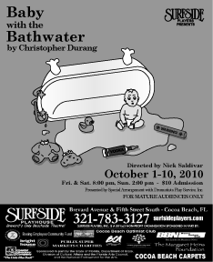
Baby with the Bathwater
Here are some poster designs I just completed for Surfside Players' production of Baby with the Bathwater, by Christopher Durang. And earlier version of the poster and a brief description of the design is available here.
Since putting it on the postcard, though, a few changes have been made. The play is a farce about a boy named Daisy and, in true Christopher Durang fashion, a lot of strange, sometimes darkly funny things happen. I originally made the design to look like a children's book, but the director wanted to make it more clear that there is something...off about the whole thing. He gave me some suggestions from the play of items to scatter around the floor of the baby. So, I added a toy made of an old pipe from a hospital, a vodka bottle with a rubber nipple on it, a teddy bear with it's head ripped off, etc.
Below are the finished designs:

11 x 17 poster (I cut off the advertisement boilerplate for the purpose of posting it here)

8.5 x 11 paper flyer (w/ boilerplate)
Black and white small newspaper advertisement.
Subscribe to:
Posts (Atom)


