Wednesday, September 8, 2010

What is a "Brand"?

Branding is a big part of what I do, or at least what I try to do, with every design I create. Here is a good article I found on Gomediazine.com that breaks the concept of a brand down to simple terms.

Enjoy/learn:

http://www.gomediazine.com/design-articles/design-industry-insight/what-is-a-brand/

Thursday, September 2, 2010

Mad Men font fail, or was it?

Yesterday, while catching up on Mad Men episodes I missed from this season, I came across this super-awesome and super-nerdy article which questioned whether or not the new Sterling Cooper Draper Price logo was written in Arial font (which was a font created by Microsoft much later than the 1960s), which would be an anachronism.


Anywho, if you like Mad Men and nerds and discussing typography, then the article below is for you!

Mad Men font fail - or was it?

Wednesday, September 1, 2010

Follow-up to Hidden Message Logos

Please check out this post  before reading below.

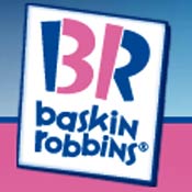
Ahhh, Baskin Robbins.  As a child, I had gone to the 31-flavored ice cream parlor and had become accustomed to this logo:


In the past few years, though, the logo has been redesigned and the branding for BR has completely changed.  Upon first glance, I just thought they kept the colors but made it look more whimsical and/or more kid-like.  I hadn't really paid much attention before but yesterday as I drove by a BR store in the Cleve I finally noticed the hidden message in the logo.


Pretty clever, B-Robs.  Pretty clever indeed.  Way to hide "31" in your own initials.

No other word to describe it but...Masterpiece

Tuesday, August 31, 2010

So many Glens, so much lightning

I have already posted a description of this Glengarry Glen Ross poster and a small version of it on a postcard on a previous post, but below are larger, updated versions of the design.  The color version is for flyers and the black and white version is a newspaper ad (although a color version may run instead).  The original design had the text centered and nothing along the side, but this new version needed a different layout to fit all the required text into these smaller formats.


I am currently working on a few small web design projects and I'm looking for more.  Do you know anyone who needs a website?  Tell 'em 'bout me!

Monday, August 30, 2010

FutureHeights!

I have been working on some advertisements for an online benefit auction for an organization called FutureHeights, which is a community-based non-profit that supports Cleveland Heights, and University Heights, Ohio.  The former is the area of town I live in.

Here is a vertical half-page ad I designed for the event, which will appear in the Heights Observer (local paper/news mag).  I ended up using the same color scheme of this blog page because I like it so much and I thought it fit the subject matter.


Thursday, August 26, 2010

Website is GO for Launch.

After a series of set-backs and creative slumps, my website portfolio is up an running at www.adrdesignonline.com


I will probably continue to tweak it in the coming days, as I hope to add some music to "what i've done" page, but please visit the site and look around.

And, while we're on the topic of creative slumps, here's an article that helped me out a bit:
Beat (even the Worst) Creative Blocks
Maybe it can help you too!

Wednesday, August 25, 2010

Not for the easily offended...

WARNING: This post contains some bad language.  Turn away now if you can't handle it, and then go cry the rest of the day because you'll seriously be missing out.

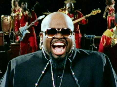
I recently saw the video for Cee-Lo Green's song "F*** You," which I have determined is not only an ingenious song (with excellent musical production), but is also clever video which can be appreciated from a graphic design perspective.  Here's the video - with more commentary after the jump.


Every second of this three minute and forty-six second video shows lyrics to the song in white sans-serif font various solid-color backgrounds, and it manages to sustain its appeal the whole time without really introducing any new design elements or video footage.


The backup singers are represented with lyrics written in parentheses, which literally made me laugh out loud a number of times, seen below.  


The song itself is a wonderfully crafted combination of new and old.  It took me a couple watchings to realize just how well the video fit with that concept.

First, the video contains clever use of panning and zoom to show you which word to look at as it is being sung - a modern take on the follow-the-bouncing-ball videos we've seen in the past.

Second, while the style of the white type on solid background is very much a relatively-recent "in" design element (due mostly to the Mac and iPod ads we've all seen over the past few years), there is faux film reel grain and crackle added to the whole video to make it appear as we are watching the video at an old movie theater.

And finally, the Motown sound mixed with modern production techniques and the sailor-like mouth of Cee-Lo Green combines to form something new and old at the same time, and also something unlike anything else I've ever heard.

Cee-Lo Green is the Soul Machine.

Tuesday, August 24, 2010

It's Fall already?

This is a quick commission for an invitation to a dinner party.  The painting at the top was provided for me and the leaves at the bottom were cut out samples from the top image.  Nothing too fancy, but gets the job done.  (Note: All the information has been changed so that they don't get random people showing up.)  

Monday, August 23, 2010

Two Glens and a Baby

Here is a postcard I did for the Surfside Players in Florida.  It advertises the next two shows Surfside will be presenting, Glengarry Glen Ross by David Mamet, which is a play about cut-throat business men in 1980's Chicago, and the other is Baby with the Bathwater by Christopher Durang, a farce about a boy named Daisy.


Glengarry Glen Ross' poster idea was suggested to me by someone at Surfside, and it depicts a man in a suit atop the Willis (then Sears) Tower with an axe, ready to cut the ropes of his climbing co-workers as they near the apex.  I combined a photo of a purple, lightning-filled sky with a photo of Willis Tower, and drew the people in later by hand, purposely leaving them faceless and sort of abstract (albeit hard to tell because of their small size).  The text is a typewriter style font, and the color scheme and whole look of the poster is meant to evoke a Tom Clancy-like book cover or, probably more accurately, a movie poster based on one of his books.

Baby with the Bathwater's idea was suggested to me by the director of Surfside's production.  He wanted a cartoon-y, bright depiction of a baby and an overturned tub.  I took this idea and set out to make the poster look like a children's book.  The baby has a small tuft of hair and a quizzical look on its face, and the font is  a simple serif font called Century Schoolbook.  More versions of these show flyers will be posted as I finish them.

Friday, August 20, 2010

Hidden Logo Tricks = Supercool

This is a post from a while back on graphicdesignblog.org, a site which I check frequently.  I think this post is particularly interesting, as it shows how some logos contain hidden images, meanings, etc.  Enjoy!


My favorites are Mosleep:

and Horror Films:


Thursday, August 19, 2010

This design is 4 lyfe.

Yesterday I completed a (com)mission for my friend Chris, which was unlike any I have done before: a tattoo.  Knowing that my design would be on his body for the rest of his life, I set out to make something supremely awesome.

Chris is a fan of superheroes and asked me to design a personalized superhero crest with his initials, "CA".  Lime green and navy blue are some of Chris' favorite colors, so I included them in my initial rough design below, with some gradient effects to make it look somewhat metallic and shiny:


Chris then sent me some feedback and a picture of an uruz rune (a symbol of strength) that he wears, which he wanted incorporated in the design somehow.  An uruz rune is shown below.

After much back and forth and collaborative brainstorming, we arrived at a final product:


As you can see, the A is formed by the tail of the C crossing an uruz rune.  This simple version will be the tattoo, but I sent Chris a shiny design for him to have, shown below.


Do you want me to design YOUR tattoo?

Wednesday, August 18, 2010

Coffee House logo - but no coffee

For a while now I have been working on designing a new logo for Butler University's Coffee House Committee, which puts on events such as open mic nights, poetry slams, concerts, etc. in Butler's campus coffee house.  One of the first things I noticed in my research was that the committee's name was spelled both "Coffeehouse" and "Coffee House" on various websites and sources.  I told them that from a branding standpoint, that is an insanely huge no-no, and that they should decide on one or the other before we finalized the logo and then stick with that spelling from here on out, with which they agreed.

One of the only guidelines for the logo was that they did not want anything coffee-related, i.e. no mugs, no coffee stains, no browns, no coffee beans.  Here were a few of my first ideas, in very basic form:


These ideas were constructed before they had reached a decision on whether or not it was "coffeehouse" or "coffee house", but they were just to give them examples of directions we could take.  


This is a later version of a logo that was going for a more official collegiate sort of look.  They liked mic and the positioning, but not the tagline or the formality.  


This was a sleeker, smoother version I tried, which is actually my favorite of the designs I did for them.  The committee ended up choosing this version below, which I designed to look more "arty", with paint strokes, handwriting font, and a sketched version of the mic:


They said it embodies the nature of their committee perfectly, so I'm happy.

Tuesday, August 17, 2010

Neglected blog and new fonts!

To my readers:

I apologize for not giving you anything to read or look at for over a month.  I plan to be back on a regular basis from here on out. 

Thank you,
Adam


Here is something that I find interesting that you may or may not.  The types of fonts available to use on the web have always been very limited, but thanks to Adobe and TypeKit, there are lots of Adobe's sweet fonts now available for use on the web, like Myriad (Adobe's standard sans-serif font, equivalent to Arial), Minion (their serif equivalent), Rosewood (if you're planning on designing a website for a wild west saloon), and some cursive-like scripts for fancy schmancy sites.  Here's the link:  http://blog.typekit.com/2010/08/16/typekit-and-adobe/  or just click the picture below.


Be back soon, I promise!

Thursday, July 1, 2010

Urban Chick Bizniz Cardz

Here is the final business card for one of the owners of Urban Chick.  I decided on an all lowercase look for the copy, leaving the URBAN CHICK itself the only thing in all caps to help organize the card, and to give it a modern feel.  The tagline/descriptor "gifts.  accessories.  art." was added by the store owners to help people understand what's inside the store, and will appear on the sign and all other materials as part of the logo.


Monday, June 28, 2010

JPAC's Hairspray

Below is a flyer I created for a Chicago theater troupe's production of the Broadway musical Hairspray.  I was instructed to use the offical Hairspray logo, which I did, and then I played with the funky color scheme to create the text boxes for the dates and information.  The TV was created from scratch and the picture of people dancing is actually people doing DDR.  I altered the photo using photoshop to look like old television in the style of American Bandstand to go along with the story of Hairspray.

If you are in the Chicago area you should check out the production.  Go to www.jpactheater.com to find out more!


Tuesday, June 15, 2010

The Wayward Email

This is a poster for an upcoming production from the Surfside Players Theatre Troupe called "The Wayward Email".  An earlier design of the poster was posted as a combined 2-show postcard (click here for link).  The play is a farce in which a man wants to send an email to his girlfriend inviting her to meet him at a resort for a romantic weekend, and accidently sends it to his entire address book instead.  Hilarity ensues, of course.


The inspiration for this poster was obviously a Windows-style computer window open like an email.  Although it is a simple design, I had a lot of fun recreating the Windows look from scratch.  As with a lot of these theater posters, there is a lot of information to put in a small amount of space, but I wanted to make sure the heart icon was the central focus.  To further the theme, I tried to make the playwright, director, and dates like the To: From: and Subject: lines of an email, with the details as the body.  11:47 am was actually when I finishing up the design, so I tossed that on there for the Windows clock.  Good luck with the performance, Surfside!

Friday, June 11, 2010

Urban Chick, Phase 4

After the color scheme was finalized and the logo was almost done, I was asked to alter the K to attempt to play up the "Urban Chic" part of the name.  I submitted a few designs, and this inversion of the black and white letter K was agreed upon by all parties involved as the best.  Below is the final Urban Chick logo. 


Currently, I am using this logo for business cards and flyers, which will be posted as they are finalized. Thanks for reading!

Thursday, June 10, 2010

Urban Chick, Phase 3

Once it was decided that the Subway design should be the main focus, the owner requested a different color scheme because they wanted something brighter, but not cute.  After trying out different color schemes using anywhere from one color to six colors, different patterns, etc., I landed on this color scheme which kept the randomness of the placement of the colors, but still had a coherent look to it.

This design uses a white background and no outlines, and below is a design which uses a black background with an outline around the letters to help them pop.  


The black background was the winner of this round, but it is not quite done yet!  Tomorrow I will unveil the final design, which will be seen on the storefront sign and print materials when the store opens in July.

Tuesday, June 8, 2010

Urban Chick, Phase 2

After the first rough designs were sorted through, we were left with the Easter-palate logo and the Subway logo, so I tried a number of different versions of each, because neither I, nor the owner, felt we had the final design yet.

One thing I tried was an inverted version of the Easter-palate logo with brighter colors to get the image above.

A request I had was to play up either the "chic" or "ur chic" in the Subway designs.  I tried a number of different ways of accomplishing this, including using different colors, different fonts, different shapes behind the letters, etc.  Most of them didn't feel like it wasn't the direction we wanted to go.  Here is one of the versions which played up the "ur chic":

One of the side effects of these types of designs was that it also tended to emphasize "bank" more than was desired.

Eventually, the Easter-palate design was thrown out for being a little too cute for what the owner is going for and the Subway design was chosen as the model to use from this point forward.

More to come!