Showing posts with label posters. Show all posts

Monday, October 4, 2010

i want! i want!

As you may or may not know, I was a longtime member of a band based in Cincinnati called Walk the Moon.  I am no longer in the band, but they are going strong, and the band is getting ready to throw a big bash to release a long-time-coming album, called i want! i want!, as well as a really sweet music video for the first single, "Anna Sun".  I am doing some of the promo materials for the show and for the band, the first of which is shown below.

Front of flyer

Back of flyer


For more information on the rockin show/video release/cd release, check the band's blog at walkthemoon1.blogspot.com.  You can also listen to their music at www.myspace.com/walkthemoonband.  If you are in the Cincinnati area, you should DEFINITELY plan to go to this party on November 13th.    

Friday, September 10, 2010

Baby with the Bathwater

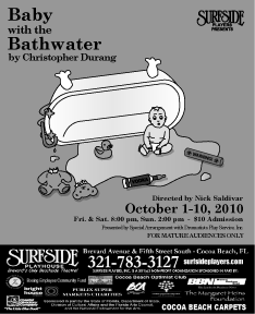
Here are some poster designs I just completed for Surfside Players' production of Baby with the Bathwater, by Christopher Durang.  And earlier version of the poster and a brief description of the design is available here.

Since putting it on the postcard, though, a few changes have been made.  The play is a farce about a boy named Daisy and, in true Christopher Durang fashion, a lot of strange, sometimes darkly funny things happen.  I originally made the design to look like a children's book, but the director wanted to make it more clear that there is something...off about the whole thing.  He gave me some suggestions from the play of items to scatter around the floor of the baby.  So, I added a toy made of an old pipe from a hospital, a vodka bottle with a rubber nipple on it, a teddy bear with it's head ripped off, etc.

Below are the finished designs:

11 x 17 poster (I cut off the advertisement boilerplate for the purpose of posting it here)


8.5 x 11 paper flyer (w/ boilerplate)


Black and white small newspaper advertisement.

Tuesday, August 31, 2010

So many Glens, so much lightning

I have already posted a description of this Glengarry Glen Ross poster and a small version of it on a postcard on a previous post, but below are larger, updated versions of the design.  The color version is for flyers and the black and white version is a newspaper ad (although a color version may run instead).  The original design had the text centered and nothing along the side, but this new version needed a different layout to fit all the required text into these smaller formats.


I am currently working on a few small web design projects and I'm looking for more.  Do you know anyone who needs a website?  Tell 'em 'bout me!

Monday, August 23, 2010

Two Glens and a Baby

Here is a postcard I did for the Surfside Players in Florida.  It advertises the next two shows Surfside will be presenting, Glengarry Glen Ross by David Mamet, which is a play about cut-throat business men in 1980's Chicago, and the other is Baby with the Bathwater by Christopher Durang, a farce about a boy named Daisy.


Glengarry Glen Ross' poster idea was suggested to me by someone at Surfside, and it depicts a man in a suit atop the Willis (then Sears) Tower with an axe, ready to cut the ropes of his climbing co-workers as they near the apex.  I combined a photo of a purple, lightning-filled sky with a photo of Willis Tower, and drew the people in later by hand, purposely leaving them faceless and sort of abstract (albeit hard to tell because of their small size).  The text is a typewriter style font, and the color scheme and whole look of the poster is meant to evoke a Tom Clancy-like book cover or, probably more accurately, a movie poster based on one of his books.

Baby with the Bathwater's idea was suggested to me by the director of Surfside's production.  He wanted a cartoon-y, bright depiction of a baby and an overturned tub.  I took this idea and set out to make the poster look like a children's book.  The baby has a small tuft of hair and a quizzical look on its face, and the font is  a simple serif font called Century Schoolbook.  More versions of these show flyers will be posted as I finish them.

Monday, June 28, 2010

JPAC's Hairspray

Below is a flyer I created for a Chicago theater troupe's production of the Broadway musical Hairspray.  I was instructed to use the offical Hairspray logo, which I did, and then I played with the funky color scheme to create the text boxes for the dates and information.  The TV was created from scratch and the picture of people dancing is actually people doing DDR.  I altered the photo using photoshop to look like old television in the style of American Bandstand to go along with the story of Hairspray.

If you are in the Chicago area you should check out the production.  Go to www.jpactheater.com to find out more!


Tuesday, June 15, 2010

The Wayward Email

This is a poster for an upcoming production from the Surfside Players Theatre Troupe called "The Wayward Email".  An earlier design of the poster was posted as a combined 2-show postcard (click here for link).  The play is a farce in which a man wants to send an email to his girlfriend inviting her to meet him at a resort for a romantic weekend, and accidently sends it to his entire address book instead.  Hilarity ensues, of course.


The inspiration for this poster was obviously a Windows-style computer window open like an email.  Although it is a simple design, I had a lot of fun recreating the Windows look from scratch.  As with a lot of these theater posters, there is a lot of information to put in a small amount of space, but I wanted to make sure the heart icon was the central focus.  To further the theme, I tried to make the playwright, director, and dates like the To: From: and Subject: lines of an email, with the details as the body.  11:47 am was actually when I finishing up the design, so I tossed that on there for the Windows clock.  Good luck with the performance, Surfside!

Thursday, May 13, 2010

Two-Show Surfside Players Postcard

Every couple shows, the Surfside Players make postcards advertising their next two productions.  Below is the postcard I did for Frost/Nixon and a new play called The Wayward Email (which won Surfside's annual playwriting competition).  There were stricter guidelines for this postcard, which required inverting and adjusting some of the Frost / Nixon coloring and finding a way to have general text that worked over both designs' color schemes.  Here is the finished product:
 

To view a later version of The Wayward Email play poster, click here.

Tuesday, April 13, 2010

Freaking Clown Shoes

This is an exercise I did for a class for a fictitious event called "Clown Town".  We were given an 8.5 x 11 flyer and a bunch of clip art like the ones used in the ad.  We were instructed to use the same copy and do whatever we wanted with it to publicize the same event.

This was the example we were given.


This is what I did with it.  I decided to do away with the clipart examples because I really disliked them all and ended up drawing the clown shoes based on a photo I found.  

Monday, April 12, 2010

Frost / Nixon

This is my first stab at the Frost / Nixon poster for the Surfside Players.

 The faded text that forms the back layer of this poster seems to not appear very well when I converted to jpeg for the web.  I may have to tweak it!

Monday, March 29, 2010

Hair (the musical) Poster Design commission

I was hired by the Surfside Players theater troupe in Brevard County, Florida, to create a series of posters, flyers, and logos for their upcoming production of "Hair."  I was given the copy, some restrictions and guidelines on some of the type, and pretty much free reign on the idea.  The previous designer had been working in Microsoft Paint (?!), so I also helped the troupe convert existing boilerplates and logos to vector artwork so that it can be more easily resized to be used for future show posters, etc.  My thanks to the Surfside players for the work!

This was the original postcard I designed for the show.

This is a smaller ad which was printed in grayscale in their local paper.  

Finally, this is an 11x17 poster with a boilerplate that contains their sponsor information.