Tuesday, September 28, 2010

Casa De Kraftmaid - Auction on October 30

This past week I was brought in to work with a few other designers on a site to advertise a large estate auction in Moreland Hills, Ohio (a suburb of Cleveland).  The house is being sold by the founder of Kraftmaid Cabinetry, Richard Moodie, and the home is quite astounding.  It is estimated to have cost around 8 million dollars and it includes a swimming pool, guest house, movie theater (with a lobby), gym, and so on!

Here is the site:

http://www.casadekraftmaid.com/

Wednesday, September 22, 2010

Invitation shminvitation

Here is an invitation I made to a private art showing Gretchen Reifsnyder is having in the fall.  Her paintings can be seen at watercolors1.blogspot.com.

This is the front, which uses a painting of hers that she selected. The information has been blocked out.

Here is the back, leaving plenty of room for addresses and stamps.  I used Photoshop to isolate the frog from a more detailed painting and to extend the branch to about twice its original length.   

Wednesday, September 15, 2010

Who knew the tilde could do so much?


So I just found out a trick using the tilde key in Adobe Illustrator.  If you hold it down while you make a shape, it continuously makes the shape everywhere the mouse goes, so you get interesting wire-frame drawings.  I decided to revert back to when I was 7 and would draw space stations and floating cities all the time.  An example drawn only with the Rounded Rectangle Tool and the 'tilde' key is above.

If floating futuristic cloud cities aren't your thing, you can just make sweet shapes.  Checkit:

Tuesday, September 14, 2010

It'll Tickle Your Innards!

I found out from a recent episode of Mad Men that Mountain Dew used to be advertised as hillbilly joy juice.  It was promoted as “zero proof hillbilly moonshine” when it first came out in the 1940's.  They even had a picture of a hillbilly trying to shoot another hillbilly (next to what looks like an outhouse) on the bottles until the 1970's:


Here is a very early commercial from 1966 featuring hillbillies, turkey-shootin' and a hot cartoon lady for your enjoyment:


I don't have that much to say on the topic, other than I find it interesting how the way you market something can have such an effect on how it is perceived by the public.  These early ads are a far cry from the EXTREME marketing of the 90's and later, but apparently it still tastes the same.  It also makes me wonder if that early marketing actually worked.  Were there that many hillbillies/hillbilly wannabes in the U.S. in the 1960's?  Seems kind of odd to me.

"It'll Tickle Your Innards" vs. "Do the Dew"
Hillbillies vs. Snowboarders
Which one is better?

Monday, September 13, 2010

Facts about Famous Brands - from GraphicDesignBlog.org

Interesting article about how 10 famous brands got their names. Click the picture or the link below for the jump.


http://www.graphicdesignblog.org/facts-about-famous-brands/

Friday, September 10, 2010

Baby with the Bathwater

Here are some poster designs I just completed for Surfside Players' production of Baby with the Bathwater, by Christopher Durang.  And earlier version of the poster and a brief description of the design is available here.

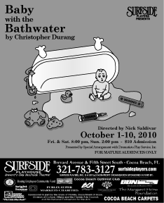
Since putting it on the postcard, though, a few changes have been made.  The play is a farce about a boy named Daisy and, in true Christopher Durang fashion, a lot of strange, sometimes darkly funny things happen.  I originally made the design to look like a children's book, but the director wanted to make it more clear that there is something...off about the whole thing.  He gave me some suggestions from the play of items to scatter around the floor of the baby.  So, I added a toy made of an old pipe from a hospital, a vodka bottle with a rubber nipple on it, a teddy bear with it's head ripped off, etc.

Below are the finished designs:

11 x 17 poster (I cut off the advertisement boilerplate for the purpose of posting it here)


8.5 x 11 paper flyer (w/ boilerplate)


Black and white small newspaper advertisement.

Wednesday, September 8, 2010

What is a "Brand"?

Branding is a big part of what I do, or at least what I try to do, with every design I create. Here is a good article I found on Gomediazine.com that breaks the concept of a brand down to simple terms.

Enjoy/learn:

http://www.gomediazine.com/design-articles/design-industry-insight/what-is-a-brand/

Thursday, September 2, 2010

Mad Men font fail, or was it?

Yesterday, while catching up on Mad Men episodes I missed from this season, I came across this super-awesome and super-nerdy article which questioned whether or not the new Sterling Cooper Draper Price logo was written in Arial font (which was a font created by Microsoft much later than the 1960s), which would be an anachronism.


Anywho, if you like Mad Men and nerds and discussing typography, then the article below is for you!

Mad Men font fail - or was it?

Wednesday, September 1, 2010

Follow-up to Hidden Message Logos

Please check out this post  before reading below.

Ahhh, Baskin Robbins.  As a child, I had gone to the 31-flavored ice cream parlor and had become accustomed to this logo:


In the past few years, though, the logo has been redesigned and the branding for BR has completely changed.  Upon first glance, I just thought they kept the colors but made it look more whimsical and/or more kid-like.  I hadn't really paid much attention before but yesterday as I drove by a BR store in the Cleve I finally noticed the hidden message in the logo.


Pretty clever, B-Robs.  Pretty clever indeed.  Way to hide "31" in your own initials.

No other word to describe it but...Masterpiece